Eastside Culture Crawl 2013

Every year when the weather starts getting a little chillier, and we all start thinking about the holidays and gift giving, the wonderful artists of the Eastside open up their warm studios to us to see what they’ve been up to all year long.

The Eastside Culture Crawl is a great way for us, as designers, to find some new inspiration in the world of furniture, art, ceramics, accessories, and the like. Here’s a snapshot of some of our favorites.


Kate Duncan – http://kateduncan.ca/
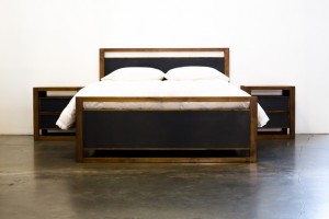
In a field monopolized by men, it is great to see Kate Duncan taking strides in the furniture design and building world.  Her attention to detail is exquisite, and her style is clean, modern and refined.

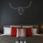
Featured piece: she had her Parallel bed collection on display. A rich walnut frame, with dark accents, also had hidden storage underneath. Beautiful detail!


Jeff Martin Joinery – http://jeffmartinjoinery.ca/
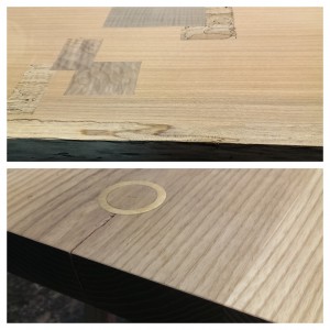
What stood out about Jeff is that he seemed to really allow the wood to speak for itself and used it to lead his design. Instead of scouring for the perfect piece, he’d allow for its imperfections to create the design. With metal and wood inlays, his table tops were super eye-catching.

Featured piece: an unfinished project that appeared to be a table top. The metal ring details were really great, and it was really neat to see the piece coming to life.


Woodstone Design (Steven Pollock) – http://www.woodstonedesign.ca/
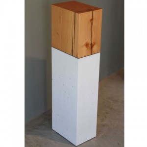
There is always something so intrinsically ‘design’ about mixing wood and concrete. Something about the mix of live and manmade materials really speaks to a well-balanced aesthetic. Steven does a great job of this over at Woodstone design.

Featured piece: wood and stone pedestals. These could really be an art piece in themselves.


Dahlhaus – http://dahlhausart.com/
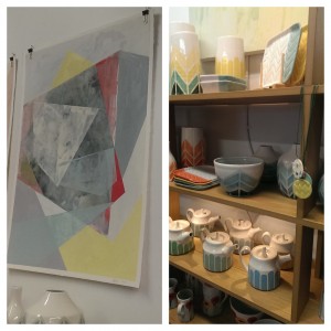
A beautiful collection of handmade ceramics and prints. Simple designs with beautiful, fresh, colors. Their pieces really had a youthful whimsy to them and would make for great accent pieces.

Featured piece: Her tea pots with matching mugs. Great Christmas gifts!


Gregg Steffensen – http://greggsteffensen.tumblr.com/
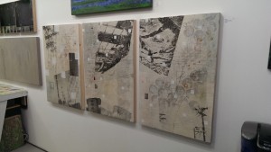
Gregg’s work in mixed media images is super graphic, and has some great depth to it. Neon was a big thing in art this year at the crawl, and that definitely apparent in his work. Such a fun, unexpected pop of color.

Featured piece: Gregg’s Trans series had a wonderful variety to them, but still worked really great together as collections.

Post Date:

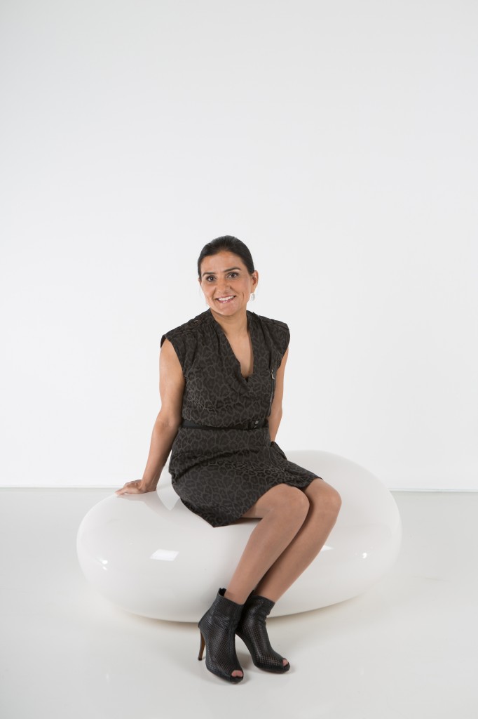
Congratulations Kulpreet!

Kulpreet Anant has truly earned the new title of “Associate” at Portico Design Group.   We welcome her to the management team.

Kulpreet has worked in both the Architectural and Interior Design fields.   In her 16 year career, she has designed interiors for luxury yachts, resorts, hotels, high rise towers and low rise multi family.

We are proud of Kulpreet’s achievements, dedication and great out of the box design.   Kulpreet holds a Bachelor of Architecture, R.I.D and is LEED AP.

Post Date:

Luxury Hotels in Spain

Lisa Hansen, a senior designer at Portico, was fortunate enough to recently holiday in Spain for several weeks.

One of the things she most appreciated was the outstanding hotel design. Below she shares a few of her experiences.

 During my stay in both Barcelona and Ibiza, I was amazed at the degree of dedication to experiential design evident in commercial spaces.  Although these spaces included restaurants, bakeries, coffee shops and retail, what grabbed my attention the most was hotels.

What I found particularly notable was the contrast in styles.   Spaces were either extremely modern; or  would honor the past with their traditional styling.

I have selected two modern hotels to share with you. Both are applauded for their contrast in style.

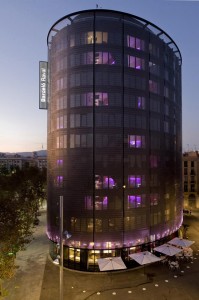
Barcelo Raval opened in Barcelona in 2008.   This unusual elliptical structure was shrouded with a stainless steel skin, to offer more privacy to the guests and accent the exterior of the building.

I chose this four star hotel  for my stay because of its great location in the heart of Barcelona. It’s within walking distance to the Gothic Quarter, Los Ramblas and many of the museums, all of which I wanted to visit.

As I recognized so many of the images of this hotel  from my library of design books, it was a “must” that I stay there. 

This hotel did not disappoint me.   The staff went above and beyond,  with their superb service.

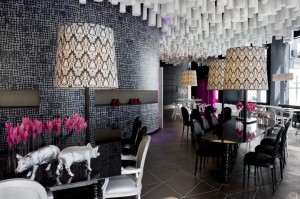
The interior design was vibrant, edgy and quirky.   Sleek pink lighting flowed over the tiled porcelain lobby floor.   In contrast, a traditional Bisazza mosaic tiled wall was complemented with futuristic  black and white furniture, all bringing a special ambience to the room.

In my opinion, the most notable detail in the lobby was the Basotect® ceiling (2200 ceiling baffles).   As an  open air bar & restaurant was located only a few feet away  from the front desk, these baffles offered both an extremely attractive aesthetic to the space as well as cover off the acoustical requirements.


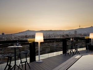
The rooftop bar, appropriately named 360, provided phenomenal views. Guest could peruse the country side through   telescopes or take a dip in the pool.


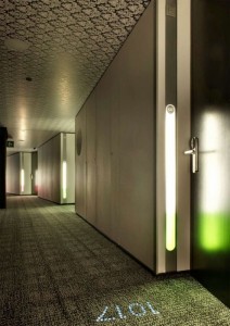
The suite entry was defined by lit room numbers, set into the printed carpet.  Pink or green LED wall lighting accented the doors.


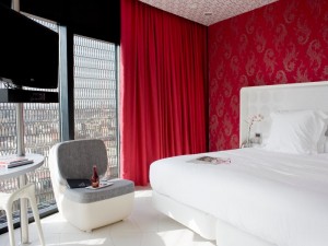
The guest rooms had an open concept feel with floor to ceiling windows and 32” TV’s. Additional details like an IPOD docking station and personal nespresso machine, which are not common in European hotel rooms, were much appreciated.   After my stay, I understood why this establishment had won so many travelers choice awards.


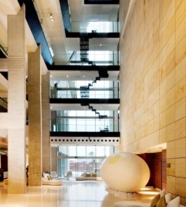
The next stop on my vacation was Ibiza. Located just minutes away from Old Town Ibiza, the Ibiza Gran Hotel offered stunning views of the Mediterranean.   On entering,   I experienced a sense of tranquility and relaxation.

The interiors could only be described as a contemporary luxury.  Considered to be an art hotel, 29 artists have helped shape the ambience of this unique hotel using earth, air, life, water and sky as their inspirations.
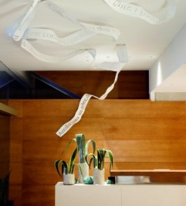
On entering the lobby, you were greeted with the “Birth Place”, a white lacquered ribbon of aluminum floating carelessly across the space.  Inscribed on the ribbon was a poem written in 1913 by Maria Villangomez, paying homage to the island of Ibiza.


Just beyond reception, massing the atrium, was “Pas”, an enormous egg shaped sculptural piece. “Pas”, primarily constructed of smooth concrete and resin, was accented with expanded polystyrene and graffiti.


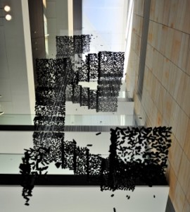
In contrast to this massive sculpture, the “existence stairs” floated 11 meters above in the open air space.  These stairs, created out of small pieces of coal suspended on transparent nylon threads, truly were a feat of wonder.


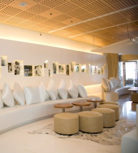
My favorite display, the coolest spot of the hotel, was the bar lounge.    Offering live music, guests could partake in enjoying an aperitif, while taking a stroll down memory lane with Tony Keeler’s photographs.  The exhibition offers you a peek into the island during the 1960’s, when Keeler was drawn to the romantic spirit of the hippy generation, who en masse, came to the island. To see Tony Keeler’s work, view click here
Post Date:

What are you doing this Canada Day

Why not spend some time Canada Day long weekend, exploring the many local art galleries we have in this great city showcasing some amazing Canadian talent and content. Whether you are looking for something playful and cheeky, or contemplative and informative, there is definitely something in store for you.

Hot Art Wet City Gallery and Shop– 2206 Main St., Vancouver

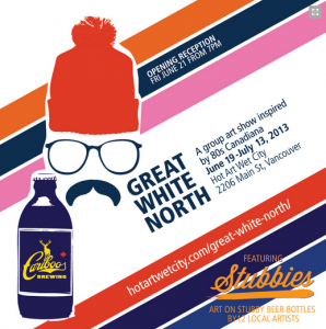
Great White North – A group art show tribute to 80’s Canadiana

Wednesday, June 19th – Saturday, July 13th

Bob and Doug McKenzie, SCTV, Bryan Adams, Degrassi, hockey without helmets, The Hanson Brothers, CBC, Mr. Dressup, David Suzuki, Corey Hart, The Beachcombers, Expo 86…do any of these ring a nostalgic bell to you? Then check out Hot Art Wet City for their 80’s Canadian pop-culture inspired show “Great White North”. Artists include Andrea Hooge, ARGH!!, Chris Bentzen, Brent Clowater, David Stein, DEDOS, Edaward Juan, Norma Jean Harvey, Exploding Haggis, Sharon Piekarski, Shary Contrary, Sheri Alexander and Alice Vogelaar. It’ll be a dooser, eh!


Monte Clark Gallery– #105-525 Great Northern Way, Vancouver

Tim Gardner

Thursday, June 13th – Saturday, July 13th

Gardner was born in Iowa city, but grew up in Canada and has called British Columbia home for most of his life. World renowned for his hyper-realistic portraits and landscapes done in watercolor or pastel, his latest showcase at Monte Clark combines these two major themes into one and the connection between the two. He presents to us landscapes with small figures surrounded by vast nature, and conversely, portraits as snapshots of the life of his subject and uses the landscape as more of a backdrop to provide us more information about the subject’s identity. While drawing from classical trends, Gardner gives as a more contemporary narrative with his ‘middle class’ subject matter and Canadian landscapes.

Tim Gardner, Roy with Red Cup, 2012, pastel on paper

The Contemporary Art Gallery – 555 Nelson Street, Vancouver

Itee Pootoogook – Buildings and Land

Friday, June 28th – Sunday, August 25th

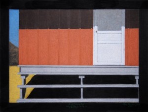
This is the first solo exhibit in a public institution by Canadian artist Itee Pootoogook, hailing from Cape Droset, Nunavut. Pootoogook belongs to a group of young Inuit artists who are taking the traditions and skills taught to them by their parents and grandparents and reshaping them for a new contemporary audience. In his large graphite works, he shows us a glimpse into the everyday life of those living in the North. Not the traditional themes of igloos and fur-clad hunters, but of recognizable contemporary elements like TV, snowmobiles and soft drinks. Focusing on northern architecture and landscapes, Pootoogook has broken out of expectations and, instead of providing us with ‘Native Art’, has given us Contemporary art that is a reflection of his own life.

Itee Pootoogook, Bright Sunny Day, 2011, coloured pencil on paper

Gam Gallery –  110 East Hastings Street, Vancouver

Wastelands: Natasha Broad, Alex M.F. Quicho and Daniel Marcus Tatterton

Friday, June 7th – Friday, July 5th

This group show both playfully and seriously studies the dichotomy that is our own backyard: a cosmopolitan city perched just inches from a great wilderness. They look at the danger, fear and fascination that lie behind our contemporary relationship to nature and how disjunctive a place it is where the wild things and recreational Vancouverites attempt to co-exist. A mixed media show showcasing the works or 3 different artists all hailing from Vancouver.

Post Date:

Skwachays Lodge

Portico has partnered with the Vancouver Native Housing Society to re-position Skwachay’s Lodge, Residence and Artist Gallery.

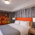
As part of a collaborative team of interior designers, our mandate is to convert this 3 star facility to boutique standards.

We are working with artist, Jerry Whitehead, www.jerrywhitehead.com  to develop concepts for the guest rooms.

Once complete, hotel guests will not only be offered comfortable surroundings, but during their stay, can partake in art workshops, and  native cuisine. Adventurous types can take part  in a traditional Smudging Ceremony and enjoy the steamy rooftop Sweat Lodge.

In conjunction to the hotel component, Skwachays Lodge also provides live/work studios for 18 Aboriginal artists.

This hotel conversion will offer these artists a venue for display of  artwork throughout the facility.

Original Painting by Jerry Whitehead

Post Date:

Toronto Project Tour Day 4


In part four of our insight into Design in Toronto we explore The Britt.

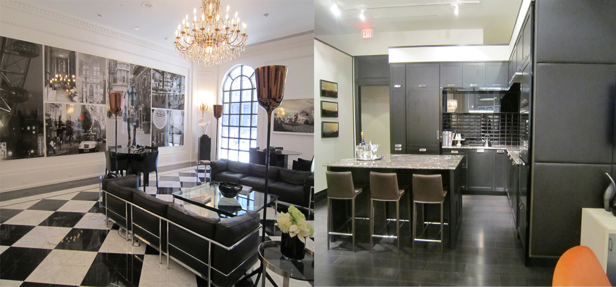
The Britt is a project conversion in downtown Toronto. Previously a Sutton Place Hotel, this new upscale condominium building,  will rise out of the existing site.

Note the British and Modern European Flare. This was evident throughout the public spaces as well as through the homes.

The public spaces speak to the exterior architecture of the building, with it’s magnificent Palladian Windows. Note the use of coffers, crown and dental mouldings and upsized baseboards.

The interiors of the suites are a quirky mix of old and new ideas.  Shaker cabinets are mixed glass flipper doors, padded walls with slick contemporary ceramic.

I think that the public spaces were more successful than the interiors, but I did still manage to glean a few new ideas.

My Toronto tour was insightful and full of surprises.   Even though this more formal design is not my particular style, I can appreciate how this does work in the Toronto environment.

Written by Tara Wells

Post Date:

Toronto Project Tour Day 3


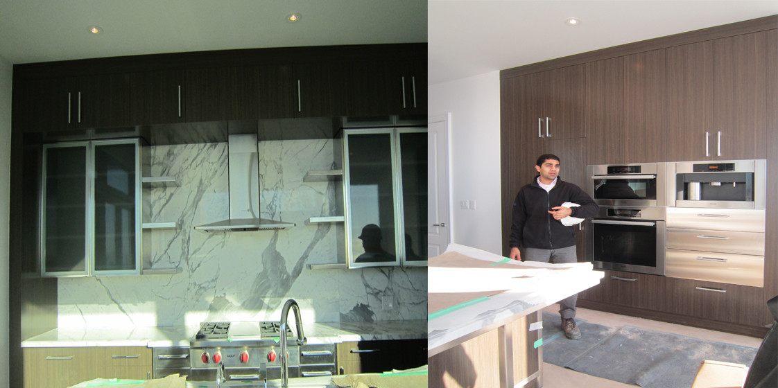
I was extremely fortunate to tour the penthouse units in the Four Seasons Residences.   There were three schemes offered to the buyer and this was the most popular, walnut cabinets with a white oak floor.

One of the surprising elements was the abundance of Carrera marble, in a kitchen application.    I was advised that the target market for these $4,000,000.00 homes predominately eats out and as such, marble was a suitable application for this kitchen.   I would love to take the Wolfe range home, if this purchaser was not planning to use it!

Note the abundance of stainless detailing.    Integrated glass doors with stainless trim, stainless shelves and a stainless support for the eating bar was designed for this Penthouse suite.

The end result was a beautiful kitchen, that I would love to have, sans the Carrera countertop, as I do love to cook in my kitchen.


Written by Tara Wells

Post Date:

Toronto Project Tour Day 2

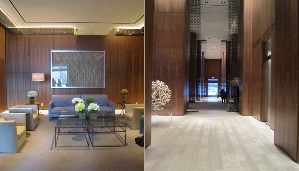
Four Seasons residential lobby & corridor

Continuing on our project tour, the other six projects we visited had a very tradition flare, something reflective of the East Coast, Boston and New York.   It was very interesting to see the change in style, within one country, simply by geographical location.

We visited the Four Seasons Residences, market condominiums, where the sales that they achieved, topped out at the highest price point in a Toronto location.

Opulance was apparent.  Volume spaces, traditional corridors with fret glass, interspersed with the odd contemporary touch, in this case, a giant twig ball.

Here, we actually saw a reintroduction of brass in tables, lamps and furnishings.


Written by Tara Wells

Post Date:

Toronto Project Tour Day 1

Toronto and Vancouver are miles apart with respect to interior design trends.

In Vancouver, almost every project you see is contemporary in feel. We like very neutral colors, lots of greys and prefer clean simple lines, as opposed to the more ornate or traditional look.

During my visit to the IDS show in January, we toured eight different projects located in Toronto’s downtown core. The majority of the projects we saw had a traditional flare. Over the next few days we will share our insights with you.

The above project by Edenshaw Developments was one of only two projects, which followed the contemporary design aesthetic that we assimilate to in Vancouver.

This project was called Chaz.  It was designed by Cecconi Simone.

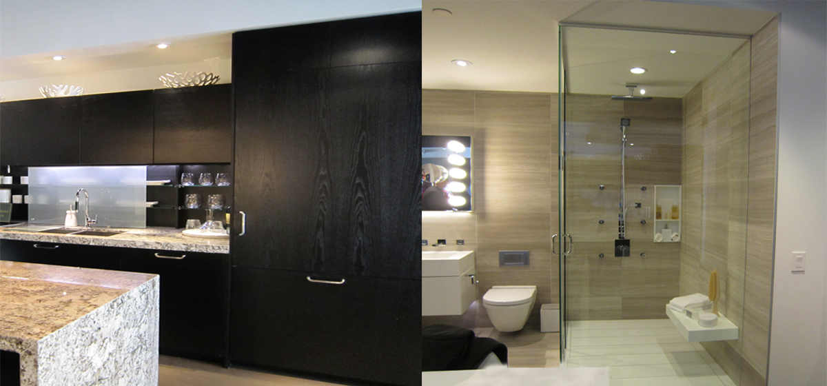
You will notice in the photo above, that versus the ever popular quartz on the west coast, they chose granite, as their selection for the kitchen countertops.

You’ll also note that Torontonians love white Corian.  Manufactured across the lake in Buffalo, New York, Corian is more readily available for the East Coast.  In Chaz, it was used for the shower base, shower seat, soap insert, integral vanity top and built in medicine cabinet.


Written by Tara Wells

Post Date:

Living Rooms To Love

3437 Roxton Ave., Coquitlam

“Orange is a happening colour, adds

vibrancy and energy. You are happy in

the space because of the colour.”

Tara Wells, Portico Design Group

Custom Art :

www.jillpilon.com

Custom Sofa and Tables:

Calibri Design

Accent Chair:

Carbon Chair at zuomod.ca

Standing Lamp:

Industrial Revolution on Granville St.

Floor Rug:

Interior Surfaces

Designer Secret:

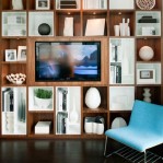
Art should be hung for the use of the space. Hang at eye level in the living room or put art in a bookshelf to add a splash of color and interest.

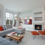
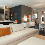
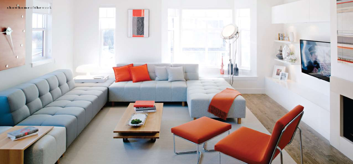
Do you love your living room? A generation ago, this space was often off-limits to kids and the family pet, and reserved exclusively for adult guests and cherished heirlooms. With much relief, contemporary living has ushered out stuffy formality and replaced it with relaxed everyday comfort. When you’re ready to unwind, curl up with the Kindle, watch a sitcom or hang out with friends, the living room should be a place that can support relaxation and entertainment in a family-friendly setting, while also being a space to show off your style. Well-planned living rooms often require a little inspiration… Here’s a showcase of four fabulous living rooms, and insight from the interior designers who created these inviting yet lavish living room spaces. Want to know where to buy the essentials, what items to splurge on, how to arrange furniture to by Janine Mackie enhance conversation and the most up-to-date trends to bring your living room to 2013 and beyond? Step inside these local showhomes and discover the building blocks to great decor. “A young hip couple that loves to entertain,” was the personality profile designer Tara Wells of Portico Design Group was given as she styled the model home at ROXTON in Coquitlam’s Burke Mountain community. Obsessed with design, the developer Mosaic Homes has made their mark by creating homes that pack a lot of function into their square footage while also making a big design statement. “The furnishings are very Urban Modern,” describes Wells. “The living room has that fun downtown vibe, yet is extremely comfortable, without being presumptuous.” Taking centre stage is the oversized sectional in stylish neutral gray wool and injected with bold hits of tangerine orange on toss cushions and accent chairs. The look is absolutely ravishing against the warm tones of the maple wood coffee table. Local art and a custom-made clock are the creative touches needed to pull this dramatic space together. “This family can use the room for anything from kids’ play dates to dancing on New Years’ Eve,” says Wells. Multi-functional furniture equips this future friendly space. The sofa pieces move for flexible seating arrangements, the tables are on casters, and the brilliant accent chairs are light and mobile.

Click here to see the full article in PDF.

Post Date: