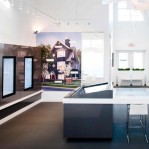
After many years and numerous proposals, a new residential-commercial development is finally ready to emerge in Victoria’s historic Chinatown. You could almost say it’s like the mythical phoenix rising from its own ashes, as Union — a development by Vancouver based Anthem Properties — replaces buildings that once occupied the entire block, including the old Finlayson building that was largely destroyed by fire in 2005.
Victoria’s Chinatown is the oldest surviving and continuously used Chinatown in Canada. It’s part of the city’s Old Town and a national historic site. Any development in this part of the city must respect the Standards and Guidelines for the Conservation of Historic Places in Canada, which the city adopted the same year as fire razed the Finlayson building.
Happily for heritage-minded city officials — and everyone else who enjoys history — the brick facade of the Finlayson building survived the fire. It’s now propped up with steel columns, but will be incorporated into the front of one of the two buildings that comprise Union, even contributing to its name since the new development seeks to unite the old with the new, according to Robert Marchand, director of sales and marketing for Anthem Properties. “[The] old is the Finlayson building and the 1881 brick,” he explains. “We’ve got a lot of brick on site actually that, as that building burned down, the heritage commission for those old buildings retained that brick, so we’re taking that brick and we’ll be using it through our centre block connector, which is Theatre Alley.”
The original Theatre Alley was a narrow passageway between buildings that opened up in the centre and was an area where people would gather for theatrical performances. Narrow alleys, intimate courtyards and densely packed housing were — and still are — characteristic of Chinatown. Marchand says they aren’t able to duplicate the old theatre alley exactly, but there will be one something like it running between Union’s two five storey buildings, with an opening at the back of the building fronting onto Pandora Avenue.
“Theatre Alley will once again connect Pandora and Fisgard, as well as be the access point to the residential lobbies,” Marchand explains. The alley will be a unique space incorporating a bistro patio, an open air space while maintaining the original charm and character.” Marchand says the new buildings will reflect the feel of the old Finlayson building in their colours, textures and materials. In addition to the old brick, for instance, the company will use new brick that’s been put through a mechanical tumbler to give it an aged look, much the same as blue jeans are stressed to make them look worn.
However, passersby won’t mistake the new Union buildings as a Disneyesque version of something from the past. And this fits with the city’s design guidelines for Old Town that state: “Our city is evolving, it is not a museum object, and we have a duty in the design of new buildings, additions to non-heritage buildings, and new urban spaces to respond to changing ways of working, living and playing.”
The city’s senior heritage planner, Steve Barber, is pleased with Anthem’s response to the city’s guidelines. “I think that their architect, Paul Merrick, did a very skilful job of coming up a building that is new contemporary design, that at the same time, in the expression of the facade and the use of materials, was able to reflect that very sensitive historical context.”
In fact, Anthem hired two architects. As well as Paul Merrick, who specializes “in the big picture and how to integrate large pieces of the puzzle,” Robert Ciccozzi’s office is detail-oriented, says Marchand. “We were really brainstorming out the best fit, the best option for the product, but still making it what Anthem’s slogan is, which is ‘creating real estate that works;’ works for the buyer, works for the seller, works for the community.”
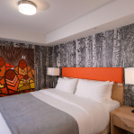
Marchand credits Ciccozzi and team for being able to tweak small details in the units — they range from 491 square feet to 1,203 square feet — that make a huge difference. For instance, in the ‘junior’ one-bedroom suites — junior means they don’t have a closet — the hall closet directly across from the bedroom has swinging doors instead of sliding doors. “So when you get up in the morning and you’re in your nightwear and you want to go from there to the bathroom, you can just open your closet door and now you’ve got this private ensuite kind of feel for a one-bedroom suite,” he explains.
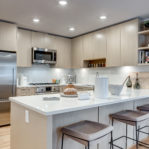
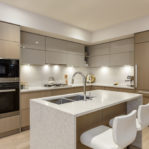
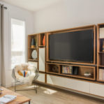
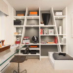
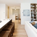
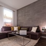
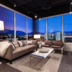
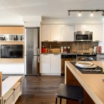
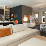
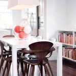
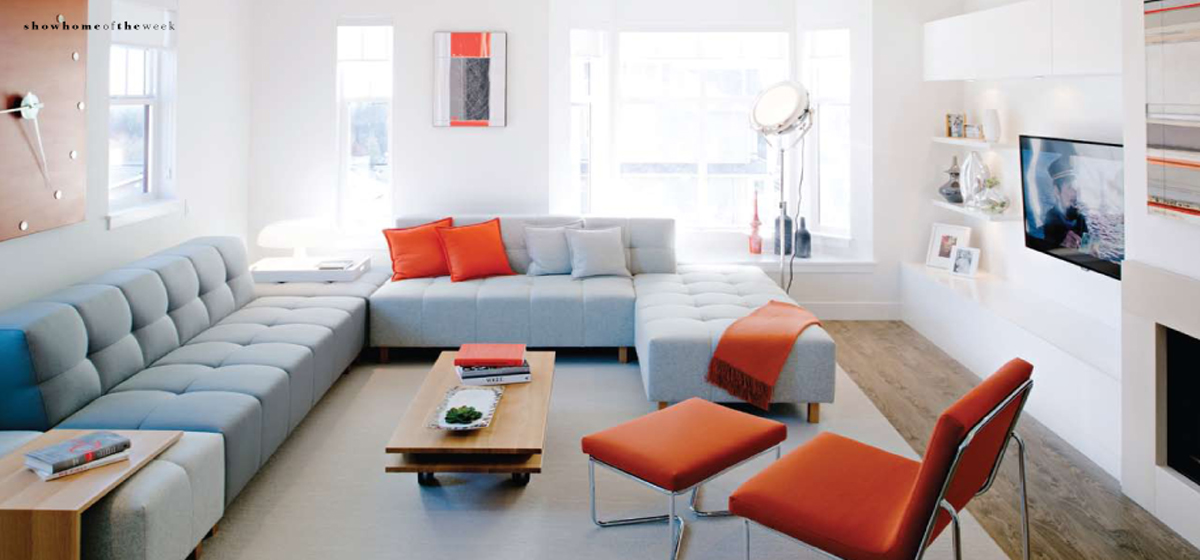
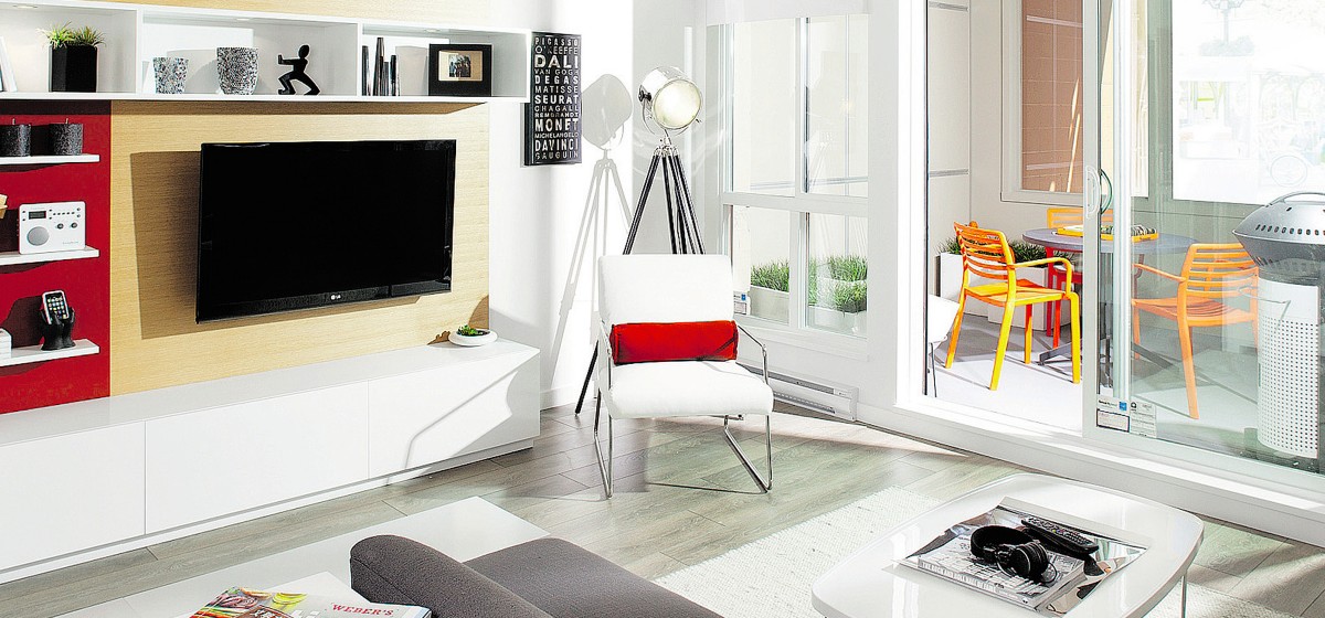
The interiors are functional in other ways, too. “You walk in and you’ve got a great new contemporary feel; sleek kitchens, durable composite stone countertops, square cut undermount sinks, oversized closets … really cool kind of union of two different styles.”
The blend of old and new, heritage and contemporary, is attracting buyers. Completion is slated for the spring of 2013, but sales started this past Canada Day and Marchand says they’re on target, with 20 to 30 sales in the works. Both the size of the units and the price — from $239,900 — $425,900 — were designed to appeal to the local Victoria market, so the company was surprised when investors from outside the Capital Region showed interest. Marchand explains this is likely due, in part, to Victoria’s low rental vacancy rate. “It’s made us look at, you know, the Vancouver market and a few other outlying areas and say, ‘Hey, you know, if you’re looking for a great property and you are looking to rent, you should be looking in Victoria’ and we feel Union has the best value.”
One of the reasons Anthem has been able to offer suites for as little as $239,000 is because only one level of parking is underground. “A lot of the construction cost in a building is in the underground parkade,” Marchand explains. “The deeper you go, the more expensive it gets.” A second level of parking will be above ground, but hidden by a landscaped courtyard between the two buildings.
Residents will be able to stroll among greenery or sit on a bench and read a book. Robert Randall, past chair of Victoria’s Downtown Residents’ Association, says there was some concern that the five-storey buildings would be too high since surrounding buildings are only three or four storeys. But Marchand says Anthem requested – and received – a variance of 2.3 metres in height to make the project viable, adding that the buildings sit back a bit from the street and won’t create big shadows.
In the end, Randall says: “I know the DRA was very happy that it was going to be a residential project” — previous proposals for the site included a hotel and a parking lot — “because we’re excited about bringing high-density residential building into the downtown core.”
by Suzanne Morphet
Vancouver Sun
 11 boxes full of food for the Greater Vancouver Food Bank Society. Thank you so much to everyone who helped us out this year. It’s going to be great delivering all of this to the food bank.


